 In this series we will be identifying some of the biggest questions and concerns associated with email marketing. From finding the right vendor to understanding how people read emails, we will be diving into it all to help you make your email marketing efforts more successful and profitable.
Now that you’ve picked the right vendor and constructed a plan of action, it’s time to consider the overall design of your email.
Keep it Simple
You don’t want to overwhelm your audience with multiple starbursts, several product photos and red text. Instead, keep it simple with a few eye-catching images, one or two main calls to action and pleasant text and colors.
You don’t want to take away from your main point with flashy images and loud, obnoxious “BUY BUY BUY” statements.
Technically Tasteful
Every email you send out should have at least two links to your website. Always give your audience something to do beyond the email and send them to a relevant page on your site. If you’re doing a product promotion, add a link to that product page. If you’re doing an email about your latest blog post, obviously take them to that actual article on your website. Don’t always send them to your homepage, either. We want people landing deep in your site getting them closer to making a conversion and finding information that they need. And always remember to test your links to make sure they are working and you’re sending people to the right place.
Make sure all images have alt text since images don’t always show up in email browsers until the user clicks “see all images.”
Build Your Brand
Remember your brand when creating the design of your email. Add the logo to the top, fill in the bottom with your social media handles, and use company fonts and colors. Be recognizable to your audience when you land in their inboxes.
Good Email Design
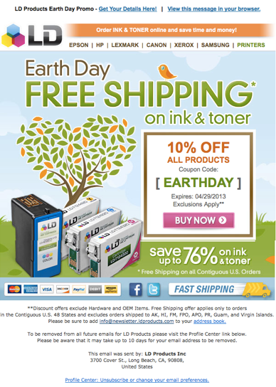
This is a great example of tasteful email design. The promotion and promotion code are easily found without being loud, it’s centered around a recognizable day, forms of payment are listed and the imagery is great. LD has put their company logo on the top left corner and added their social media handles at the bottom creating brand awareness. You can also see that this email has a direct point: Free shipping on ink and toner and 10% of all products. The marketing team was working closely with the sales team here and it’s clear that they had a plan in place.
Obviously some businesses don’t have the capability of creating a graphic like this, but it’s still possible to create something very similar with just a little PhotoShop skill or user-friendly vendors like MailChimp.
The bottom line for any email design, whether you’re promoting a product or sending a newsletter, is to keep it simple. People just don’t have the time to sift through a long, drawn out email and they certainly don’t have time to figure out what your point was. And please, don’t use starbursts.


