Are You Suffering from Bad Data?
A few months ago, a client sent me a report that they were getting from a vendor. Their request was that I “interpret” the data, as it was not clear that the data supported the statements of success that followed. The client suspected something was off, and he was right. Statistics can be manipulated, charts can be made to look good, and unless you know what you are looking at, and deciphering the data making up the claim, you could be suckered in.
Bad Information, Bad Data, Bad Reporting
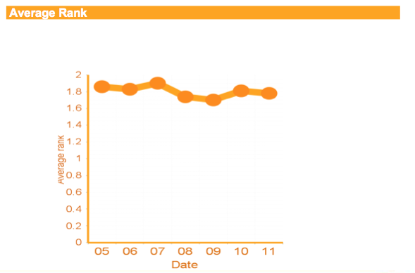
Now, on to the worst data chart I have ever seen. This was a chart to show the “Average Paid Search Position.”
However, it is devoid of any real information:
Left Column: Avg Rank
The first problem with this chart is that it is generated to show the average rank in a paid search position. So, the main problem here is the numbering index used for the position reporting. There is no such thing as an average rank of 0.4!
You either rank 1,2,3,4 and so on, or you don’t. The y-axis is pure fantasy.
Baseline: Rank by Day
The rank by day makes a major assumption. Anyone who does any kind of PPC marketing knows that a PPC ad can change positions multiple times in a day, especially in an aggressive market. Time, by itself, is not a particularly good explanation for variations. We have 7 days reported, but no explanation for any other dynamic. Clicks relative to position? Are clicks and position consistent throughout the week? Additional context must be added to have any insights that will result in action. Otherwise, this generates more questions than it answers,
I have no problem reporting the general ad position, but is that really a critical piece of evidence without any other context? Additional info, such as click-thru rates, CPC and number of additional ads, maybe even ad location would add a completely new dimension, and provide much better insights.
Misleading Interpretations
Here is the main problem that I have with this chart. It is misleading.
Western culture reads from right to left. When we view charts., we expect them to be provided in that same linear mentality, and we make our assumptions based on the direction of the data line. most people, when viewing a chart for the first time, will look at the line, see it going up and assume that it is a good thing. This is why we tend to call good trends “hockey stick growth” the data moves up and to the left, signaling an increase.
However, this chart is made to show average paid rank position. Because the y-axis seems to be dynamic, as the numbering does not start at 1 (which is should). Also, because the numbering starts from low to high, it will create a trend line that is counter-intuitive to the reader.
If the trend line goes up, it will be because the average rank goes down!
The chart essentially lies to the reader about the average position. Because the line will never reach 0, and can only rise to a maximum of 2, the trend will always bounce neatly between an average position of 1.6 and 2. As a line, it will look steady and even rise as the average position goes down – creating a false sense of success and saying, “nothing to see here, everything looks good!”
In addition, because of the “fluid” negative numbers on the y-axis, there is a buffer built in to avoid the trend live ever going down beneath the halfway point in the cart – magically, the trend line will always remain high – and will go even higher with an average ranking of 2!
At this point, I have to quote Edward Tufte, from his book, The Visual Display of Quantitative Information.
“Each part of a graphic generates visual expectations about its other parts and, in the economy of graphical perception, these expectations often determine what the eye sees. Deception results from the incorrect extrapolation of visual expectations generated at one place on the graphic to other places.” (emphasis added)
Prevent Junk Charts
Ensure that the charts in your reports contain relevant, factual data and support the claims made.
Review the data axis to be sure that the numbers are actual and not distorted. The numbering should match reality.
Make sure that the information being reported is critical to measuring your goals. If the reports or charts are not focused on your goals, or how to achieve them, then they are window dressing and not worth the time to create.
Ask yourself – Does this chart enhance my understanding of what it takes to make money, make more money, change budget, change actions or result in any kind of actionable or insightful change in my organization?

